Explicity
Brand Guidelines
This document defines the core principles of the Explicity brand system. It explains how our identity is applied across products, platforms, and communications to ensure clarity, consistency, and trust.
Introduction
The “Explicity” name, the Explicity logo, and all associated product names, research titles, visual assets, and trademarks are the property of Explicity.
These guidelines are intended to help our partners, collaborators, resellers, clients, developers, researchers, publishers, and other third parties understand how to properly reference, use, and display Explicity’s trademarks, branding elements, and proprietary materials in their communications, products, and published assets.
All use of Explicity’s name, logo, and brand elements must remain consistent with our brand standards and must not misrepresent affiliation, endorsement, or partnership without formal authorization.
Explicity Audio
Explicity Brand Guidelines
Logo
Aurea
The Aurea logo is more than a visual identity; it represents the guiding essence behind Explicity — clarity shaped with harmony.
At its core, Aurea symbolizes balance, interconnected thinking, and intentional design. The layered floral form reflects the natural unfolding of ideas, much like a bloom opening with purpose and precision. Each petal intersects seamlessly, expressing unity, structure, and refined creativity.
Within Explicity, Aurea embodies the meeting point between thoughtful human insight and structured innovation. The soft curves of the form convey warmth and openness, while the precise symmetry reflects discipline, clarity, and strategic direction.
Minimal in style yet rich in meaning, the Aurea symbol stands for growth, alignment, and conscious creation — a timeless mark that represents both elegance and strength.


Wordmark
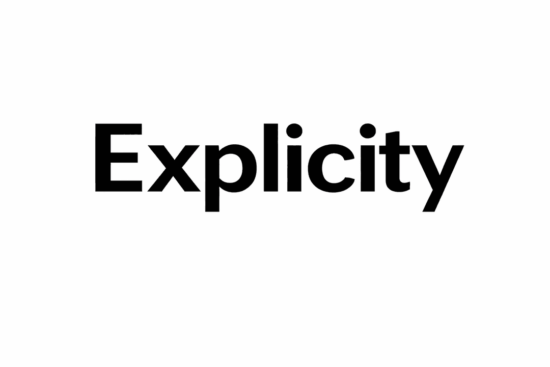
The Explicity wordmark represents clarity in its purest form. Strong, bold, and uncompromising, it reflects the brand’s commitment to direct thinking and structured innovation.
Set in clean, uppercase typography, the wordmark conveys authority, confidence, and modern precision. The balanced spacing between each letter reinforces stability and transparency — values that define Explicity’s approach to design and strategy.Where the Aurea symbol expresses harmony and interconnected creativity, the Explicity wordmark anchors the identity with strength and focus. Together, they create a complete visual language — one rooted in clarity, intention, and forward momentum.Minimal in form yet powerful in presence, the Explicity wordmark ensures instant recognition across digital platforms, print, and brand applications.
How to Use Our Logos
Do
- Use the Explicity logo only in contexts directly related to Explicity's products, services, or official communications.
- Maintain proper spacing and clear visibility around the logo.
- Use approved logo files without distortion or alteration.
- Ensure high contrast and clarity across digital and print materials.
Don't
- Modify, stretch, recolor, or distort the Explicity logo.
- Place the logo on low-contrast or visually cluttered backgrounds.
- Combine the logo with other brand marks without approval.
- Use the logo in misleading or unauthorized contexts.
Official Explicity Brand Assets
EXPLICITY Wordmark
Aurea Symbol

Colors
Black
#000000
Black represents authority, precision, and depth Within Explicity, it reinforces a sense of clarity and intentional design. The color communicates confidence and seriousness, positioning the brand as structured, reliable, and thoughtfully engineered rather than decorative or trend-driven.
White
#FFFFFF
White symbolizes clarity, openness, and intentional simplicity Within Explicity, it represents transparency in thought and purity in execution. The presence of white space reflects confidence — allowing ideas to breathe and structure to stand without distraction.
Purple
#A78BFA
Purple balances innovation with care. It introduces a modern, human touch while maintaining a sense of calm — supporting Explicity’s role as a technology-driven yet patient-first healthcare platform.
Why We Chose These Colors
Explicity operates at the intersection of clarity and structured creativity. In environments where precision and intention matter, our color system is deliberately minimal to reflect focus, discipline, and refined thinking.
Black and white form a strong clinical foundation, mirroring the seriousness and precision required in healthcare. This ensures the brand feels dependable and authoritative in sensitive medical contexts.
Black and white form the foundation of the identity, expressing balance and visual harmony. Black conveys authority, confidence, and depth while white introduces openness, clarity, and breathing space. Together, they create a strong, timeless framework that allows the Aurea symbol to stand with presence and purpose.
Rather than relying on excessive color, Explicity embraces restraint. This controlled palette reinforces the brand’s commitment to intentional design, structured innovation, and transparent communication. The result is a visual identity that feels modern, confident, and enduring — perfectly aligned with Explicity’s philosophy of clarity shaped through harmony.
Dos and Don'ts: Language
Brand Partnerships
When the Explicity wordmark is displayed alongside partner or third-party logos, clear spacing and a defined visual hierarchy must always be maintained. Logos should never be positioned too closely in a way that compromises clarity, legibility, or brand distinction.
Each logo must appear in its officially approved format and proportional size. The Explicity wordmark and any partner marks must remain unaltered at all times. Distortion, cropping, recoloring, rotation, opacity changes, or any other visual modification is strictly prohibited.
All co-branded materials, including but not limited to digital assets, marketing collateral, presentations, and promotional content, are subject to prior review and written approval by Explicity and the respective partner. This approval process ensures compliance with branding standards, visual consistency, and proper representation of both brands.


Typography
Explicity’s typography is designed to reflect clarity, structure, and refined expression. The type system balances modern precision with subtle warmth, creating a visual language that feels both authoritative and thoughtfully human.
The selected typeface includes a comprehensive range of weights — Light, Regular, Medium, Semibold, and Bold — each accompanied by corresponding italic styles. This versatility ensures a clear visual hierarchy across applications, from bold statements and headlines to supporting text and detailed information.
Special attention has been given to spacing, alignment, and letterform geometry to maintain exceptional legibility across digital and print environments. Balanced proportions and clean character construction reinforce consistency while enhancing readability across varying screen sizes and layouts.
The typography system also supports advanced typographic features such as ligatures, tabular numerals, and case-sensitive punctuation. These capabilities enable polished, professional presentation in structured, content-driven contexts.
Overall, Explicity’s typography embodies the brand’s core principles — clarity, intention, and harmony — supporting a visual experience that feels modern, confident, and purposefully designed
Font Weights & Styles
Explicity typography includes the following core weights, each paired with an italic variant:
- Light / Light Italic — Used for subtle UI elements, secondary labels, and large decorative text.
- Regular / Regular Italic — Primary body text for optimal readability and balance.
- Medium / Medium Italic — Used for emphasis, UI labels, navigation items, and supporting headings.
- Semibold / Semibold Italic — Section headings, buttons, and key interface highlights.
- Bold / Bold Italic — Primary headlines and high-impact brand messaging.
Usage & Legibility
Careful attention has been given to spacing, alignment, and character proportions to ensure consistent legibility across screen sizes and formats. The typography system performs reliably in both dense data layouts and spacious brand expressions.
Supported typographic features include ligatures, tabular numerals, and case-sensitive punctuation, enabling polished and accurate presentation in professional and data-driven contexts.
Brand Expression
Explicity’s typography reflects the brand’s core values of simplicity, reliability, and care. By combining technical precision with a warm, human tone, the type system supports Explicity’s mission to make healthcare more accessible and stress-free.

Brand Imagery
Explicity imagery should feel calm, minimal, and human. Visuals should reduce anxiety, avoid clutter, and support clarity — never overwhelm. Our imagery system is designed to reflect the same values as our product: trust, simplicity, and care.


Using Our Logo and Wordmark with Imagery
Explicity logo and wordmark must always be used in harmony with our imagery system. The examples above represent the visual tone that should surround our brand identity. When placing the Explicity logo or wordmark in marketing materials, product interfaces, or communications, ensure that the supporting imagery follows this same calm, minimal, and human-centered style.
Busy, chaotic, or emotionally intense visuals must not be paired with the Explicity identity. Our logo and wordmark should only appear within visual environments that reflect clarity, trust, and reassurance — reinforcing Explicity as a reliable healthcare platform.
Preferred Imagery
- Soft gradients and natural, diffused light
- Minimal compositions with clear visual focus
- Abstract or symbolic healthcare-related visuals
- Neutral and calming color palettes
Avoid
- Busy hospital scenes or chaotic environments
- Overly dramatic or emotionally intense visuals
- Hard shadows, harsh lighting, or strong contrast
- Generic stock-style medical clichés
Usage Terms
The term “Marks” refers to all trademarks, brand assets, and identifying elements used by Explicity, including but not limited to the Explicity name, logos, wordmarks, icons, illustrations, and design elements.
By using Explicity’s Marks, you acknowledge that Explicity is the sole owner of these Marks and that any goodwill generated through their use accrues exclusively to Explicity.
Permission to Use Our Marks
- Our Marks may only be used in accordance with these Brand Guidelines.
- The permission granted is non-exclusive (Explicity may grant similar permissions to others) and non-transferable (you may not grant usage rights to any third party).
- Explicity’s Marks must not be displayed more prominently than your own company name, product name, or branding.
- Explicity may update these guidelines from time to time, and all uses of our Marks must be updated within a reasonable timeframe to comply with any changes.
- Explicity reserves the right to review the use of its Marks and may require modifications or removal if the usage does not meet brand standards.
- Explicity may revoke permission to use its Marks at any time, and upon notice, all use must cease promptly.
Product & Technology References
If your application, service, or project integrates with Explicity’s platform, systems, or AI-powered features, any references must be accurate, clear, and not misleading.
Explicity brand names, product names, or proprietary technology names must not be used in application titles, company names, domain names, or product branding in a way that suggests ownership, endorsement, or official affiliation without explicit written approval.
Prohibited Usage
- Do not incorporate Explicity’s Marks into your own trademarks, logos, or branding.
- Do not create names, designs, or marks that are confusingly similar to Explicity’s branding.
- Do not imply partnership, sponsorship, or endorsement unless formally approved by Explicity.
Compliance
All use of Explicity’s Marks must comply with applicable laws, regulations, and Explicity’s platform policies. Failure to comply may result in revocation of usage rights and further action if necessary.
Author
Explicity